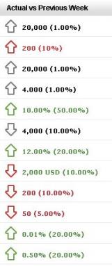
Site Trends and Marketing Dashboards use trending arrows to show how the current performance compares to performance in the same time frame of the past. The example below shows an example of trending arrows.

Interpreting the Arrows
Trending arrows provide a visual cue on whether a trend is a positive or negative change, depending on the increase or decrease over time. Because an increase or decrease can be positive or negative depending on the specific KPI, the direction of the arrow puts the increase or decrease in perspective. For example, if the value of returns has decreased over time that is a positive change so the arrow would be facing down (because of the decrease) and green to indicate that a decrease is positive.
Arrow Colors
Trending arrows are either red, green, or gray depending on whether the performance is a positive, negative, or neutral trend:
- Red arrows indicate that the change over time is not a positive trend. For example, a red arrow would be used if your revenue per visit decreased from the previous time frame.
- Green arrows indicate that the change over time is a positive trend. For example, a green arrow would be used if your sales increased from the previous time frame.
- Grey arrows indicate the change over time is neither a positive or negative trend. An example of a neutral trend would be if the number of marketing emails you sent increased or decreased from the previous time frame. Since the number of emails you send doesn't necessarily increase your revenue or have a positive or negative effect on your store it is considered neutral regardless of the trend.
Arrow Direction
Trending arrows will point up or down, depending on whether the trend from the previous time frame was an increase or decrease:
- Arrows facing up mean that the value of the KPI increased over time.
- Arrows facing down mean the value decreased over time.