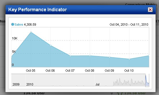
When viewing Site Trends and Marketing Dashboards you may see small blue line graphs similar to the example below. These graphs are called sparklines and they show how a particular KPI has trended over time.

What a Sparkline Shows
A sparkline shows how a KPI has performed over a defined period of time. The timeframe shown in the sparkline is the same timeframe selected for the dashboard or Site Trends and sparklines show the trend for the KPI over the last seven of the timeframe selected. For example, if you are viewing monthly data, the sparkline will show data for the last seven (7) months. See Time Frame for more about timeframes.
Summary View vs Detail View
The initial view of a sparkline is actually a summary view. Click on the sparkline itself to see a more detailed view of the trend in a larger graph. There are a few things you should note when viewing the detailed graph:

- The name of the KPI being reported on, as well as the value for that KPI appears in the upper-left corner of the window. If you hover the cursor over a data point (the circles on the graph) that value will change to show how the KPI performed on the day or time your cursor is over.
- Click and drag on the graph itself to move back and forward in time.
- Use the controls at the bottom of the graph to adjust the time period shown in the graph. Once you change the time period from what was used by default, you can then click on a date in the graph and the graph will update to show information